ENERGY

Enpal Customer Portal: Designing for the 48-hour Anxiety Window

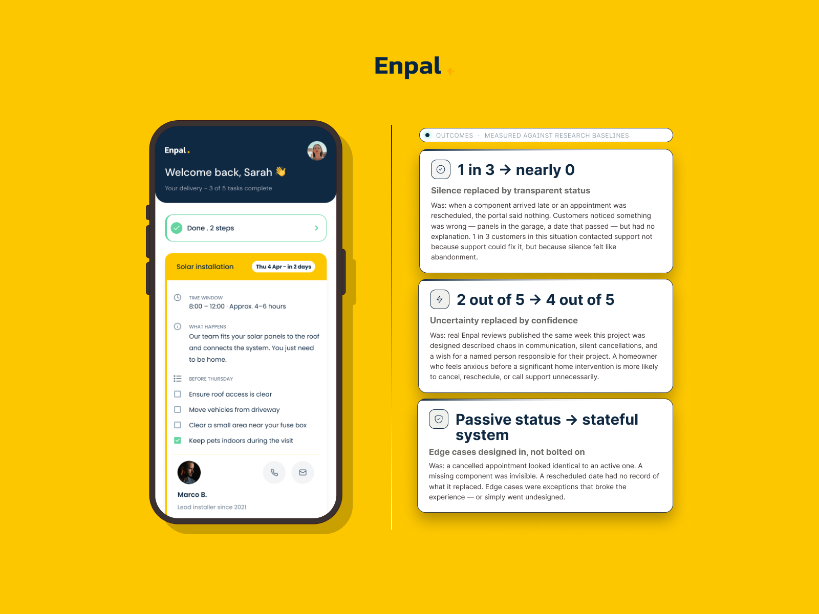
The canceled appointment, rescheduled date, and missing component warning are sourced from real reviews. Each one removes a specific information black hole that real customers described.

The client was Germany’s first green unicorn, a solar installation for homeowners.

MY ROLE

I worked as a solo designer on research, UX, UI, and edge cases for a 4-day sprint. I created a one-page portal that guides homeowners through a 5-step solar installation journey.

my process

The brief asked for a progress tracker. I reframed it: how do you reduce anxiety for a homeowner 48 hours before strangers arrive to work on their roof? Four recent Enpal Trustpilot reviews confirmed the real problem: missing communication, unnamed installers, and unexplained delays.

design rationale

I structured the page as Done/Now/Next. Completed steps collapse into a single row, so the active step is always above the fold. The named installer card came directly from a customer review asking for a responsible person. The preparation checklist shifts users from passive to active.
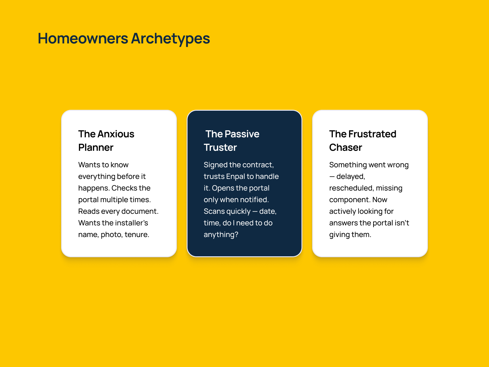
Three distinct emotional states, one design serving them all. The Anxious Planner needs the checklist, named installer, and documents. The Passive Truster needs date, time, and one clear action—then they're done. The Frustrated Chaser needs warning states, transparent history, and a contact person one tap away. Every design decision in the portal traces back to serving at least one of these three people at their specific moment of need.
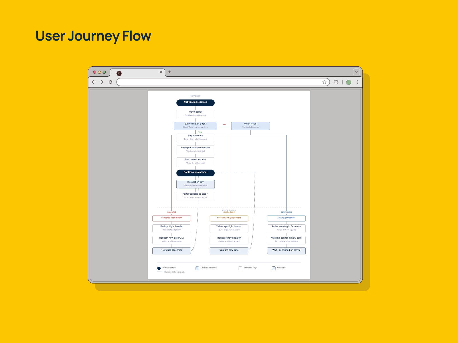
The portal serves two distinct journeys. The happy path guides a prepared homeowner from notification to confirmed installation in six steps—open, orient, prepare, meet the installer, confirm, done. The error branch activates when the Done row shows a warning. A single routing decision —which issue?—splits into three states: a canceled appointment surfaces a red spotlight with a reason and a request-new-date action; a rescheduled appointment preserves transparency by showing both the original and new date; a missing component surfaces an amber warning at two levels simultaneously—in the collapsed Done row and inside the Now card—so the customer never has to hunt for the reason their installation date may shift. Both cancellation and reschedule paths reconnect to the confirm appointment step once resolved, keeping the system stateful rather than linear.
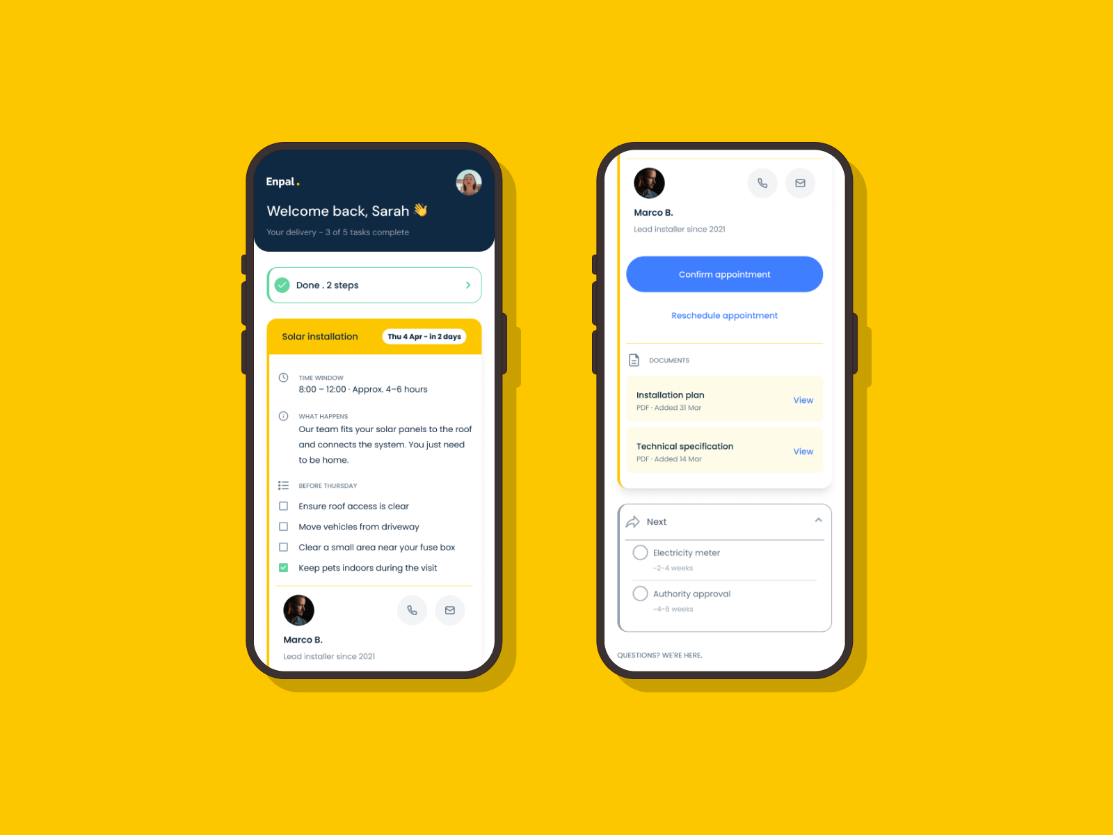
The primary brief scenario. Steps 1 and 2 complete, solar installation in two days. The Done row collapses completed steps into one line. The Now spotlight card leads with a time window, a preparation checklist, and a named installer, Marco B. Documents sit in context below the CTA. The Next group shows upcoming steps with honest timeframes. One design, everything a homeowner needs before Thursday.
crowd of people on a town square

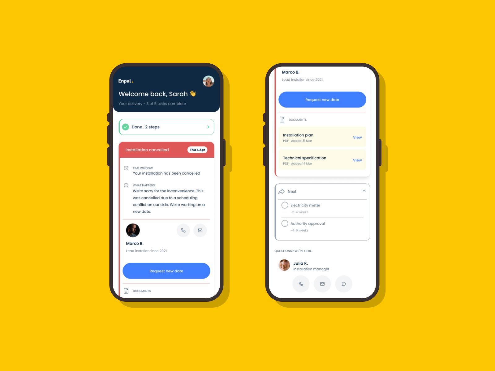
When an appointment is canceled, the spotlight header turns Error Red—not alarming, but unmistakably different from the happy path. Plain-language explanation replaces the checklist. Marco B. remains visible for direct contact. The CTA becomes Request new date. Directly addresses Rolf's review—three silent cancellations. This design names the problem and gives the customer a clear next action.
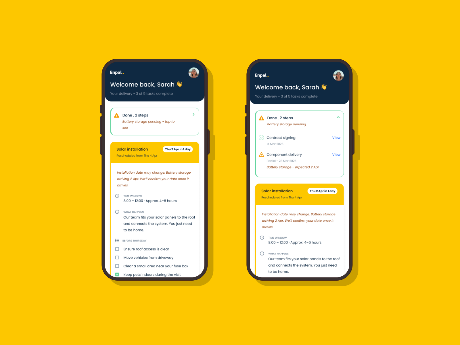
Two states side by side. Left: Done row shows an amber warning and Battery storage pending—tap to see. Right: the expanded Done group reveals that component delivery was partial, with the specific missing item and its expected date. The Now card carries a warning banner in both states, so the customer never has to hunt for the reason their installation date might shift. Rick's review described panels in a garage for three weeks. This design answers that question the moment the portal opens.
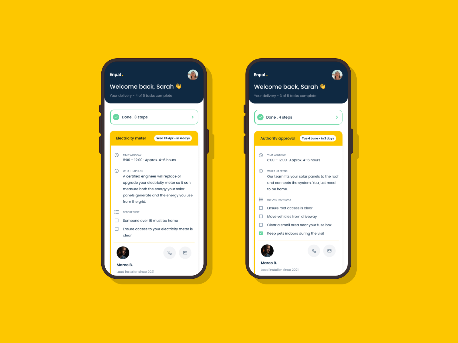
Two screens proving the architecture scales. Left: Step 4 active — electricity meter—Done shows 3 steps, different checklist, different what happens copy. Right: Step 5 active—authority approval—Done collapses 4 completed steps into one row, Now card is immediately visible above the fold. No scrolling required. The Done/Now/Next structure works identically across every step in the journey.

RESULT

I created eight screens that cover the journey. Every decision traces to a review, a research finding, and a measurable outcome.

Email

Toptal

LinkedIn

Berlin, Germany

13349

rameenghafoor@gmail.com

ENERGY

Enpal Customer Portal: Designing for the 48-hour Anxiety Window

The canceled appointment, rescheduled date, and missing component warning are sourced from real reviews. Each one removes a specific information black hole that real customers described.

The client was Germany’s first green unicorn, a solar installation for homeowners.

MY ROLE

I worked as a solo designer on research, UX, UI, and edge cases for a 4-day sprint. I created a one-page portal that guides homeowners through a 5-step solar installation journey.

my process

The brief asked for a progress tracker. I reframed it: how do you reduce anxiety for a homeowner 48 hours before strangers arrive to work on their roof? Four recent Enpal Trustpilot reviews confirmed the real problem: missing communication, unnamed installers, and unexplained delays.

design rationale

I structured the page as Done/Now/Next. Completed steps collapse into a single row, so the active step is always above the fold. The named installer card came directly from a customer review asking for a responsible person. The preparation checklist shifts users from passive to active.

Three distinct emotional states, one design serving them all. The Anxious Planner needs the checklist, named installer, and documents. The Passive Truster needs date, time, and one clear action—then they're done. The Frustrated Chaser needs warning states, transparent history, and a contact person one tap away. Every design decision in the portal traces back to serving at least one of these three people at their specific moment of need.

The portal serves two distinct journeys. The happy path guides a prepared homeowner from notification to confirmed installation in six steps—open, orient, prepare, meet the installer, confirm, done. The error branch activates when the Done row shows a warning. A single routing decision —which issue?—splits into three states: a canceled appointment surfaces a red spotlight with a reason and a request-new-date action; a rescheduled appointment preserves transparency by showing both the original and new date; a missing component surfaces an amber warning at two levels simultaneously—in the collapsed Done row and inside the Now card—so the customer never has to hunt for the reason their installation date may shift. Both cancellation and reschedule paths reconnect to the confirm appointment step once resolved, keeping the system stateful rather than linear.

The primary brief scenario. Steps 1 and 2 complete, solar installation in two days. The Done row collapses completed steps into one line. The Now spotlight card leads with a time window, a preparation checklist, and a named installer, Marco B. Documents sit in context below the CTA. The Next group shows upcoming steps with honest timeframes. One design, everything a homeowner needs before Thursday.

crowd of people on a town square

When an appointment is canceled, the spotlight header turns Error Red—not alarming, but unmistakably different from the happy path. Plain-language explanation replaces the checklist. Marco B. remains visible for direct contact. The CTA becomes Request new date. Directly addresses Rolf's review—three silent cancellations. This design names the problem and gives the customer a clear next action.

Two states side by side. Left: Done row shows an amber warning and Battery storage pending—tap to see. Right: the expanded Done group reveals that component delivery was partial, with the specific missing item and its expected date. The Now card carries a warning banner in both states, so the customer never has to hunt for the reason their installation date might shift. Rick's review described panels in a garage for three weeks. This design answers that question the moment the portal opens.

Two screens proving the architecture scales. Left: Step 4 active — electricity meter—Done shows 3 steps, different checklist, different what happens copy. Right: Step 5 active—authority approval—Done collapses 4 completed steps into one row, Now card is immediately visible above the fold. No scrolling required. The Done/Now/Next structure works identically across every step in the journey.

RESULT

I created eight screens that cover the journey. Every decision traces to a review, a research finding, and a measurable outcome.

Email

Toptal

LinkedIn

Berlin, Germany

13349

rameenghafoor@gmail.com

ENERGY

Enpal Customer Portal: Designing for the 48-hour Anxiety Window

The canceled appointment, rescheduled date, and missing component warning are sourced from real reviews. Each one removes a specific information black hole that real customers described.

The client was Germany’s first green unicorn, a solar installation for homeowners.

my role

I worked as a solo designer on research, UX, UI, and edge cases for a 4-day sprint. I created a one-page portal that guides homeowners through a 5-step solar installation journey.

my process

The brief asked for a progress tracker. I reframed it: how do you reduce anxiety for a homeowner 48 hours before strangers arrive to work on their roof? Four recent Enpal Trustpilot reviews confirmed the real problem: missing communication, unnamed installers, and unexplained delays.

design rationale

I structured the page as Done/Now/Next. Completed steps collapse into a single row, so the active step is always above the fold. The named installer card came directly from a customer review asking for a responsible person. The preparation checklist shifts users from passive to active.

Three distinct emotional states, one design serving them all. The Anxious Planner needs the checklist, named installer, and documents. The Passive Truster needs date, time, and one clear action—then they're done. The Frustrated Chaser needs warning states, transparent history, and a contact person one tap away. Every design decision in the portal traces back to serving at least one of these three people at their specific moment of need.

The portal serves two distinct journeys. The happy path guides a prepared homeowner from notification to confirmed installation in six steps—open, orient, prepare, meet the installer, confirm, done. The error branch activates when the Done row shows a warning. A single routing decision —which issue?—splits into three states: a canceled appointment surfaces a red spotlight with a reason and a request-new-date action; a rescheduled appointment preserves transparency by showing both the original and new date; a missing component surfaces an amber warning at two levels simultaneously—in the collapsed Done row and inside the Now card—so the customer never has to hunt for the reason their installation date may shift. Both cancellation and reschedule paths reconnect to the confirm appointment step once resolved, keeping the system stateful rather than linear.

The primary brief scenario. Steps 1 and 2 complete, solar installation in two days. The Done row collapses completed steps into one line. The Now spotlight card leads with a time window, a preparation checklist, and a named installer, Marco B. Documents sit in context below the CTA. The Next group shows upcoming steps with honest timeframes. One design, everything a homeowner needs before Thursday.

crowd of people on a town square

When an appointment is canceled, the spotlight header turns Error Red—not alarming, but unmistakably different from the happy path. Plain-language explanation replaces the checklist. Marco B. remains visible for direct contact. The CTA becomes Request new date. Directly addresses Rolf's review—three silent cancellations. This design names the problem and gives the customer a clear next action.

Two states side by side. Left: Done row shows an amber warning and Battery storage pending—tap to see. Right: the expanded Done group reveals that component delivery was partial, with the specific missing item and its expected date. The Now card carries a warning banner in both states, so the customer never has to hunt for the reason their installation date might shift. Rick's review described panels in a garage for three weeks. This design answers that question the moment the portal opens.

Two screens proving the architecture scales. Left: Step 4 active — electricity meter—Done shows 3 steps, different checklist, different what happens copy. Right: Step 5 active—authority approval—Done collapses 4 completed steps into one row, Now card is immediately visible above the fold. No scrolling required. The Done/Now/Next structure works identically across every step in the journey.

RESULT

I created eight screens that cover the journey. Every decision traces to a review, a research finding, and a measurable outcome.