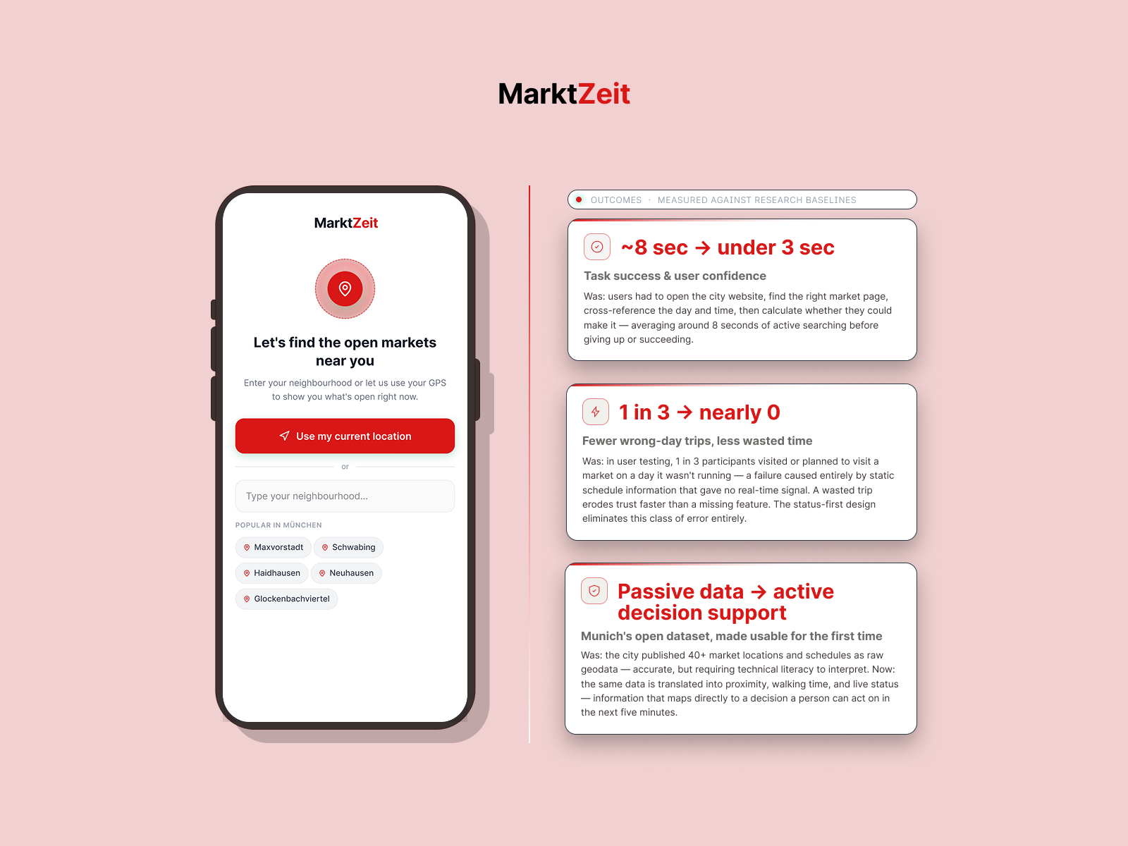
MarktZeit is a mobile-first tool for Munich residents and newcomers who miss local weekly markets due to narrow, irregular opening windows.


MY ROLE
Sole designer across the full process — research, problem framing, interaction design, prototyping, and usability testing with newcomers and working professionals.
DESIGN RATIONALE
The interface converts raw schedule data into three real-time states: Open Now, Opening Soon, and Closed with next window shown. Distance is displayed in walk minutes, not kilometers. Scope was kept deliberately tight — no directories, no vendor profiles, no feature creep.
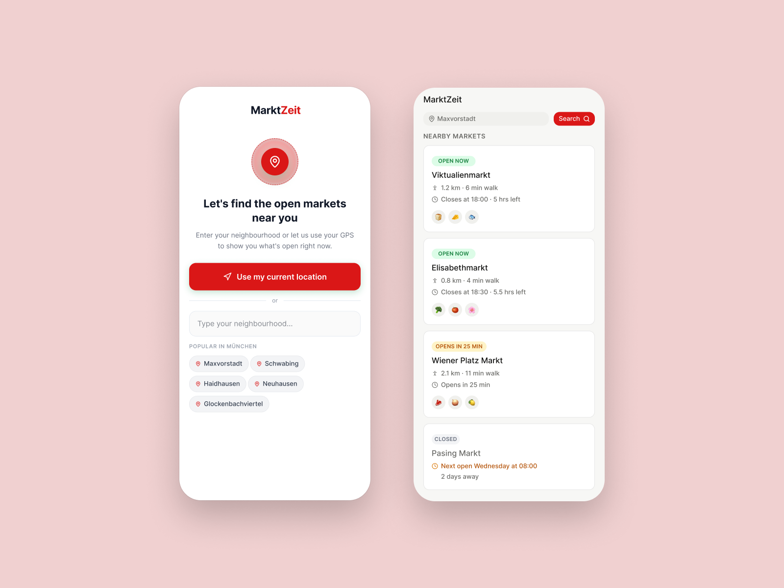
The entry point asks only one thing: where are you? Users can share their GPS location with a single tap or type a neighborhood manually. Popular neighborhood chips reduce friction for newcomers who may not yet know Munich's district names. Once the location is confirmed, the app immediately surfaces nearby markets, sorted by real-time status — open now, opening soon, or closed — with the next window shown. The list does the filtering; the user just reads the result.
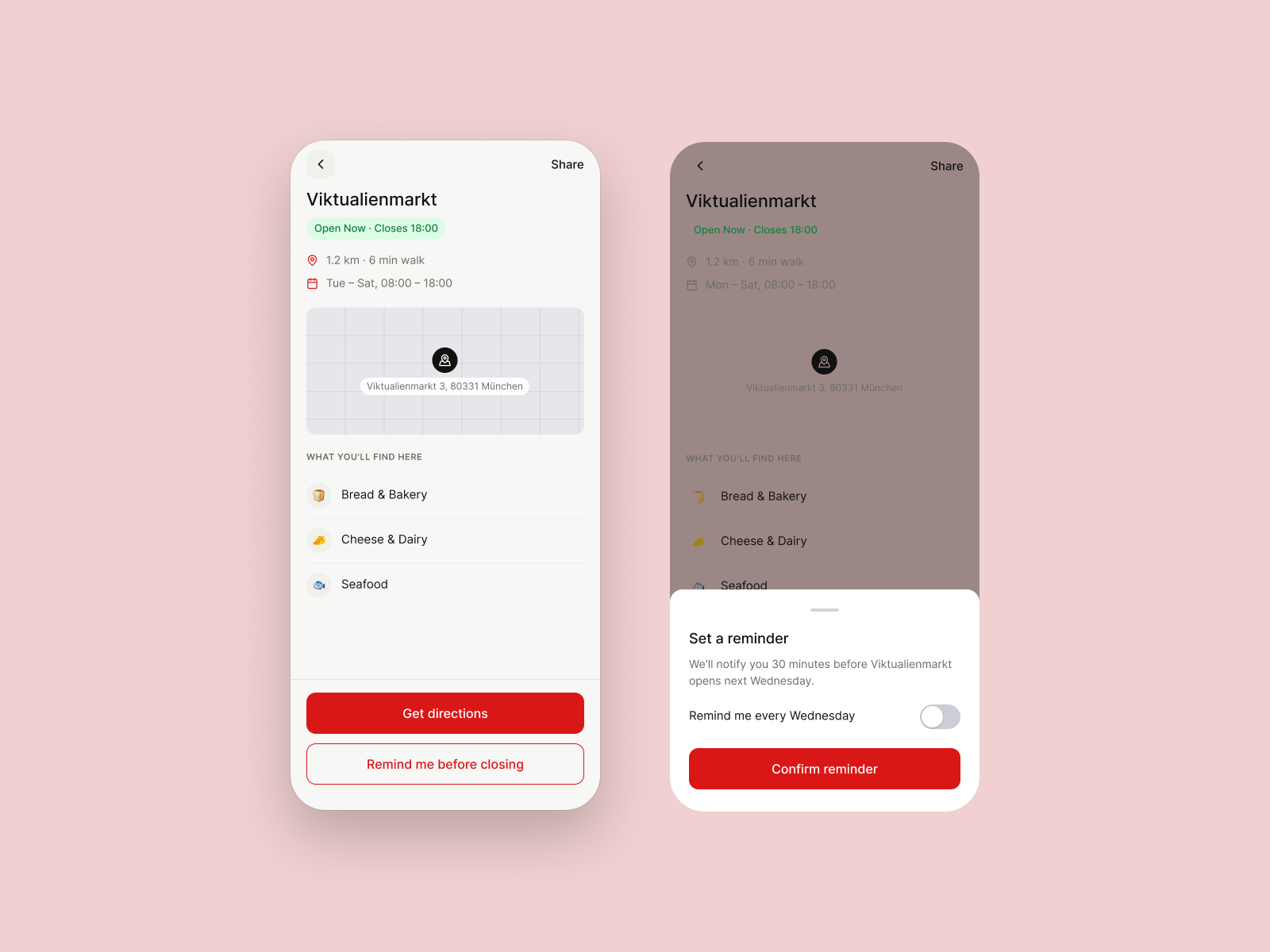
The detail screen gives a user everything needed to make a go/no-go decision: current status, walking distance in minutes, full weekly schedule, a map pin with the street address, and a glanceable list of what's sold there. No account, no scrolling through tabs. The "Remind me before closing" button opens the reminder sheet as a bottom sheet overlay — keeping the user in context rather than navigating away. The sheet defaults to off, putting the choice clearly in the user's hands.
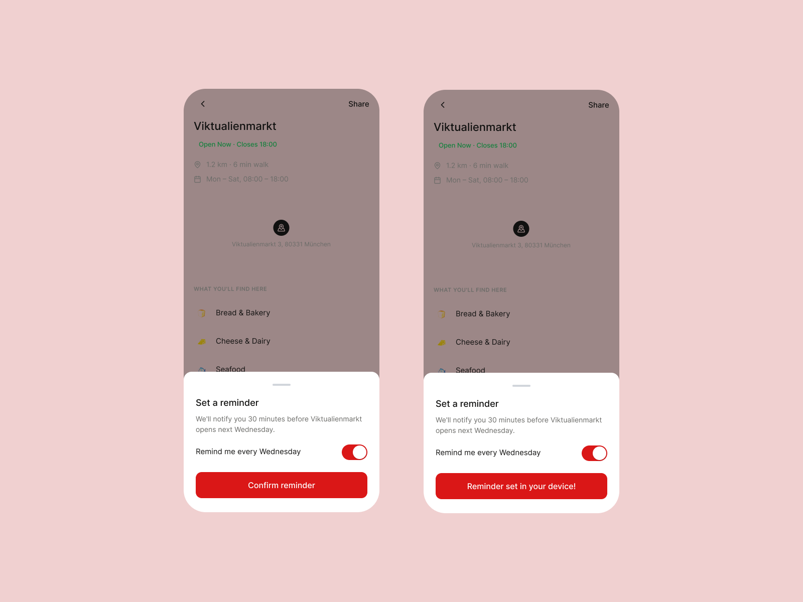
Two states of the same sheet shown side by side. On the left, the user has enabled the recurring weekly reminder — the toggle turns red to signal an active commitment. On the right, after tapping confirm, the button changes to "Reminder set in your device!" — a clear, plain-language confirmation that something real has happened on their phone. This closing moment matters: it turns an abstract action into a tangible outcome, and it directly addresses the core research finding that people simply forget the market exists until it's too late.
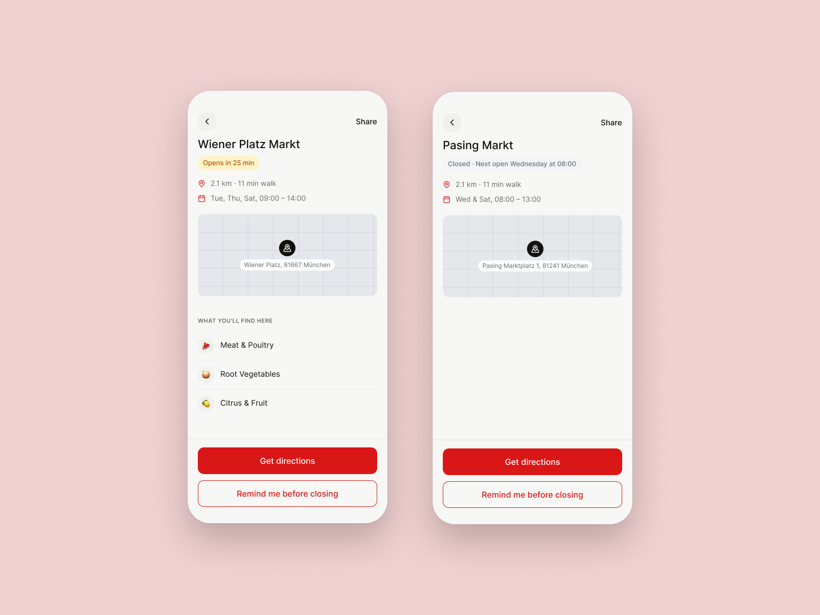
Two edge cases that most market tools ignore entirely. On the left, Wiener Platz Markt shows an amber "Opens in 25 min" badge — enough time to walk there. The detail view still shows vendors and directions, so the user can commit to going before the window opens. On the right, Pasing Markt is closed, but instead of a dead end, the screen shows exactly when it will next open and how many days away it is. The closed state is designed as a recovery path, not a wall — a user who arrives too late leaves with a plan rather than with nothing.
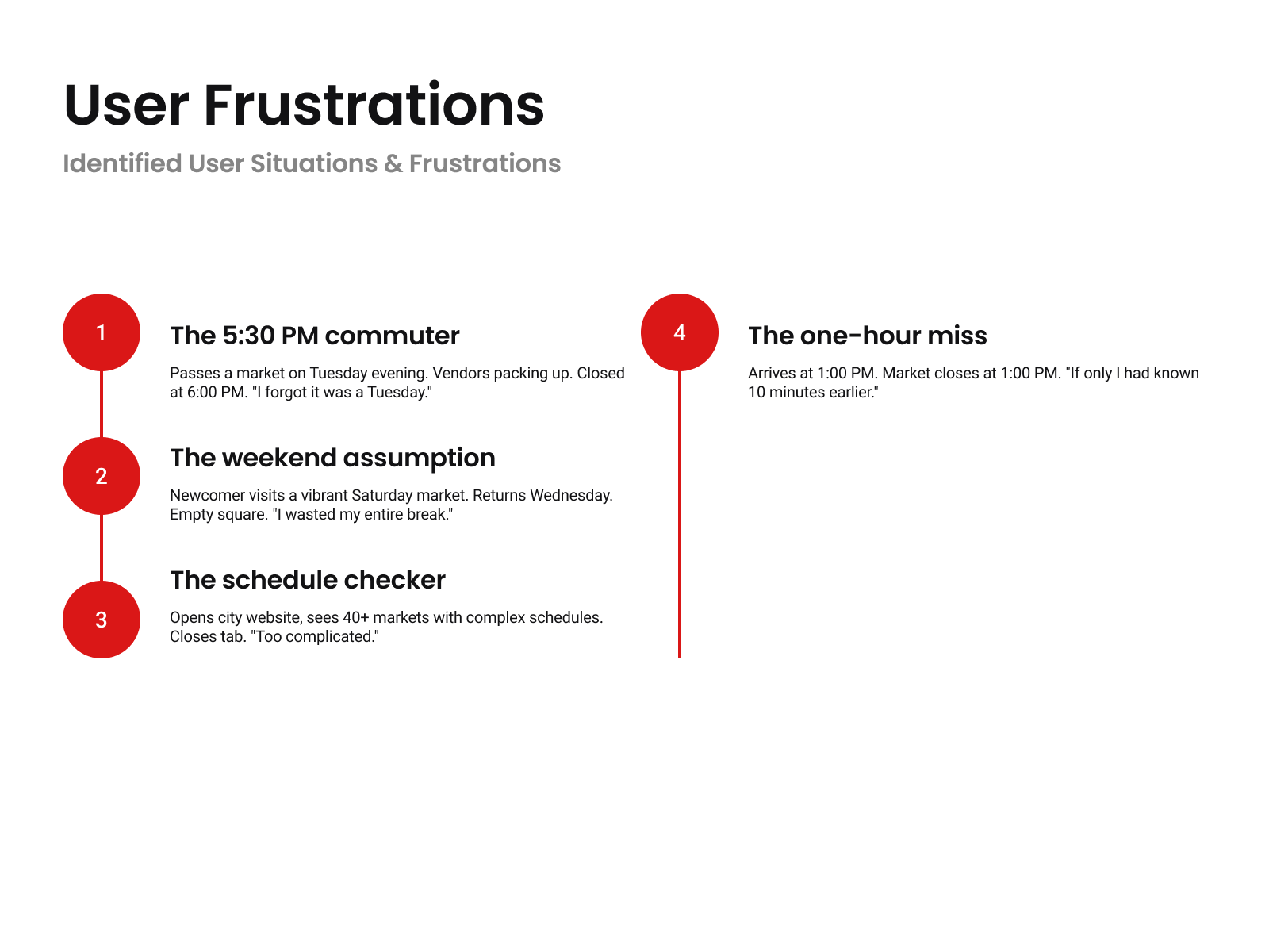
Four research-grounded scenarios that define the problem space. Each one captures a specific moment of failure rather than a general complaint — the commuter who forgot it was Tuesday, the newcomer who assumed the Saturday market ran all week, the user who opened the city website and closed it within seconds, and the person who arrived exactly at closing time. These are not edge cases; they are the four most common ways the same underlying problem surfaces across different user types. Framing them as named situations rather than statistics makes the research findings immediately recognizable to anyone who has ever tried to visit a local market.
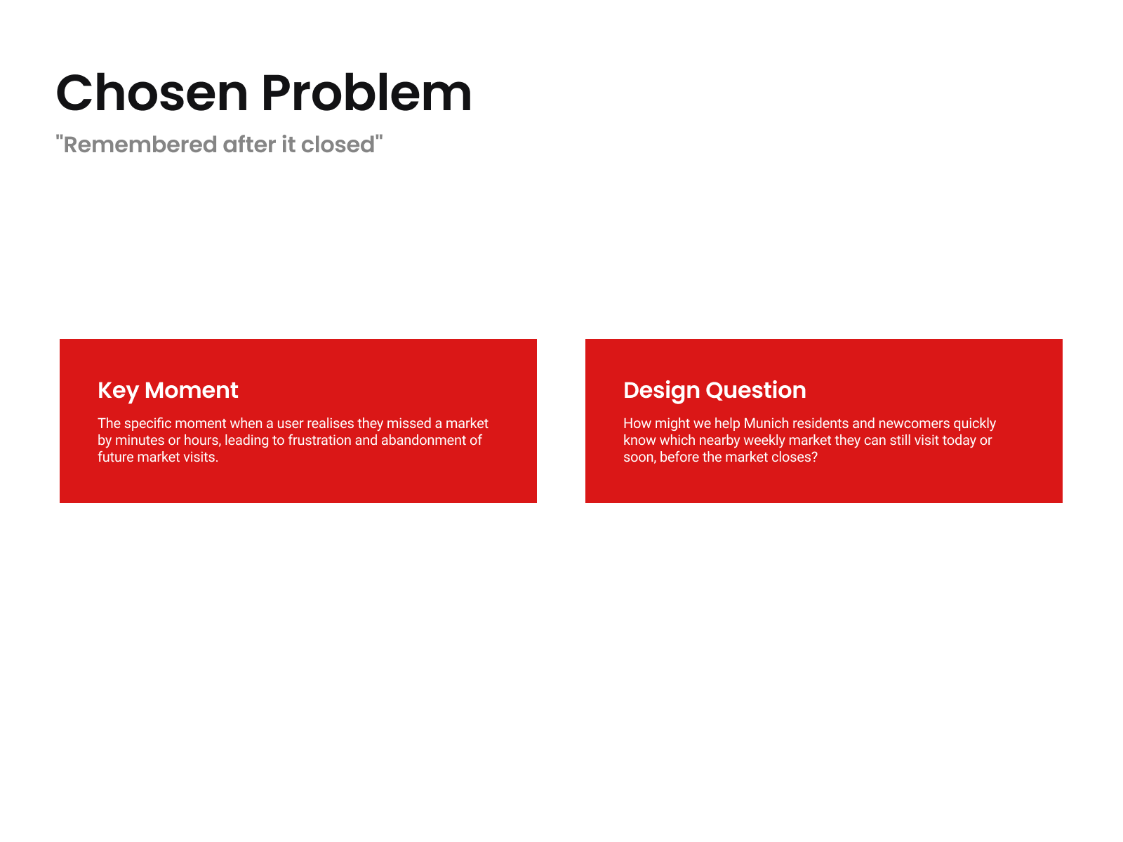
Out of the four frustrations identified in research, one was selected as the design focus: the moment a user realizes they missed the market, not by a day, but by minutes or hours. This framing matters because it shifts the problem from "people don't know about markets" to "people know but still fail to get there in time." That distinction drives the entire solution. The design question on the right — how might we help residents know which market they can still visit today, before it closes — is intentionally narrow. It rules out building a directory, a social platform, or a discovery tool, and constrains the solution to a timing problem with a timing answer.
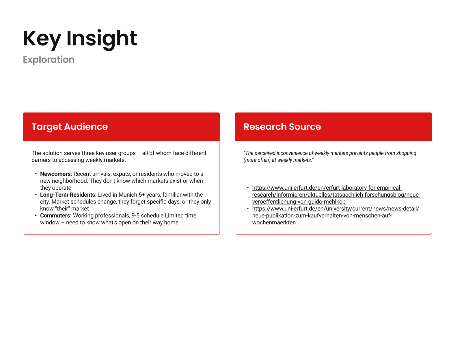
The research grounding behind the problem choice. Academic secondary research confirmed that perceived inconvenience — not lack of interest — is the primary reason people stop visiting weekly markets. Three distinct user groups face this inconvenience in different ways: newcomers who have no mental model of the city's market schedule at all, long-term residents who know markets exist but forget the specific days, and commuters who have narrow windows and need an answer fast. The solution had to serve all three without requiring any of them to learn a new system or remember new information.
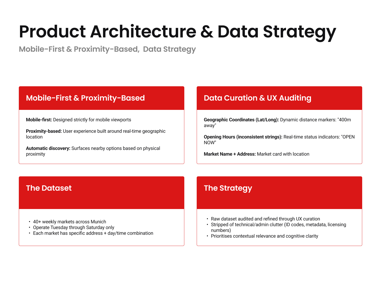
The technical and design foundation on which the solution is built. The city of Munich publishes open geodata for 40+ weekly markets — locations, addresses, and opening times — but in a raw format designed for databases, not for people making decisions on a lunch break. This slide documents the translation layer: geographic coordinates become walking distance in minutes, inconsistent time strings become live status indicators, and administrative metadata is stripped entirely. The result is a dataset that maps one-to-one with what a user actually needs to answer a single question in under three seconds.

RESULT
Deliverables included mobile screen flows, a color and typography system, Figma-ready component prompts, and a documented usability evaluation with honest findings and next-iteration improvements.

