Team
1 Content Manager · 1 Growth Manager · 1 UX Designer
Timeline
1 month
Year
2024
Clients
Executives, procurement managers, technical evaluators, cloud operators exploring platform capabilities


01 impact
traffic Growth
15%
→
50%
Peak Conversion Rate
1%
→
5.5%
02 target users
Cloud operator
Needs a unified platform to oversee the health of services and their capacity management.
Developer
Needs to identify problems faster and debug them efficiently, without leaving the flow.
03 my role
I led data-driven UX audits to identify conversion bottlenecks, then translated findings into actionable design recommendations that moved marketing from assumptions to evidence-based decisions.
04 Process
1. Audit Setup
Defined evaluation criteria, selected high-traffic pages, and deployed Hotjar heatmaps, scroll maps, and session recordings across the marketing funnel.
2. Data Collection
Gathered quantitative metrics (bounce rates, exit points, scroll depth, CTA clicks) and qualitative signals (user session recordings, click patterns, micro-conversions) across landing pages, docs, and key conversion points.
3. Insight Synthesis
Mapped data patterns to specific UX friction points. Identified where users disengaged, which messaging resonated, and where CTAs failed to convert high-intent visitors.
4. Recommendation Development
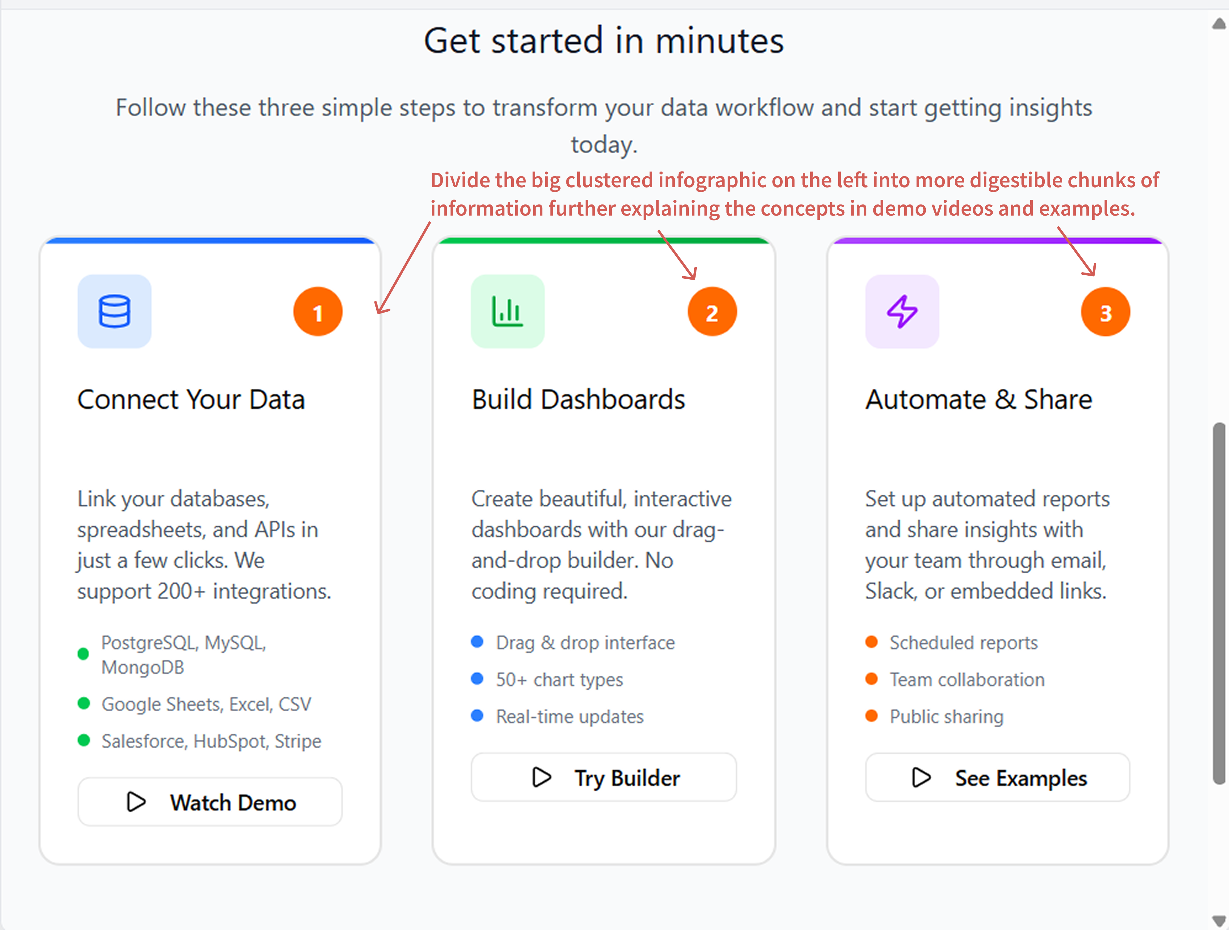
Prototyped solutions for each friction point with clear business impact rationale: improved hero messaging, sticky mobile CTAs, contextual sign-up flows, and documentation improvements.
5. Cross-Functional Alignment
Presented findings to product, engineering, and marketing stakeholders. Prioritized recommendations by effort vs. impact. Integrated into the product roadmap.
6. Post-Launch Tracking
Measured impact of deployed changes. A/B tested hero copy, CTA placement, and onboarding flows. Iterated based on performance data.
06 Key Challenges
- 67% Bounce from Unclear Value Prop
Challenge
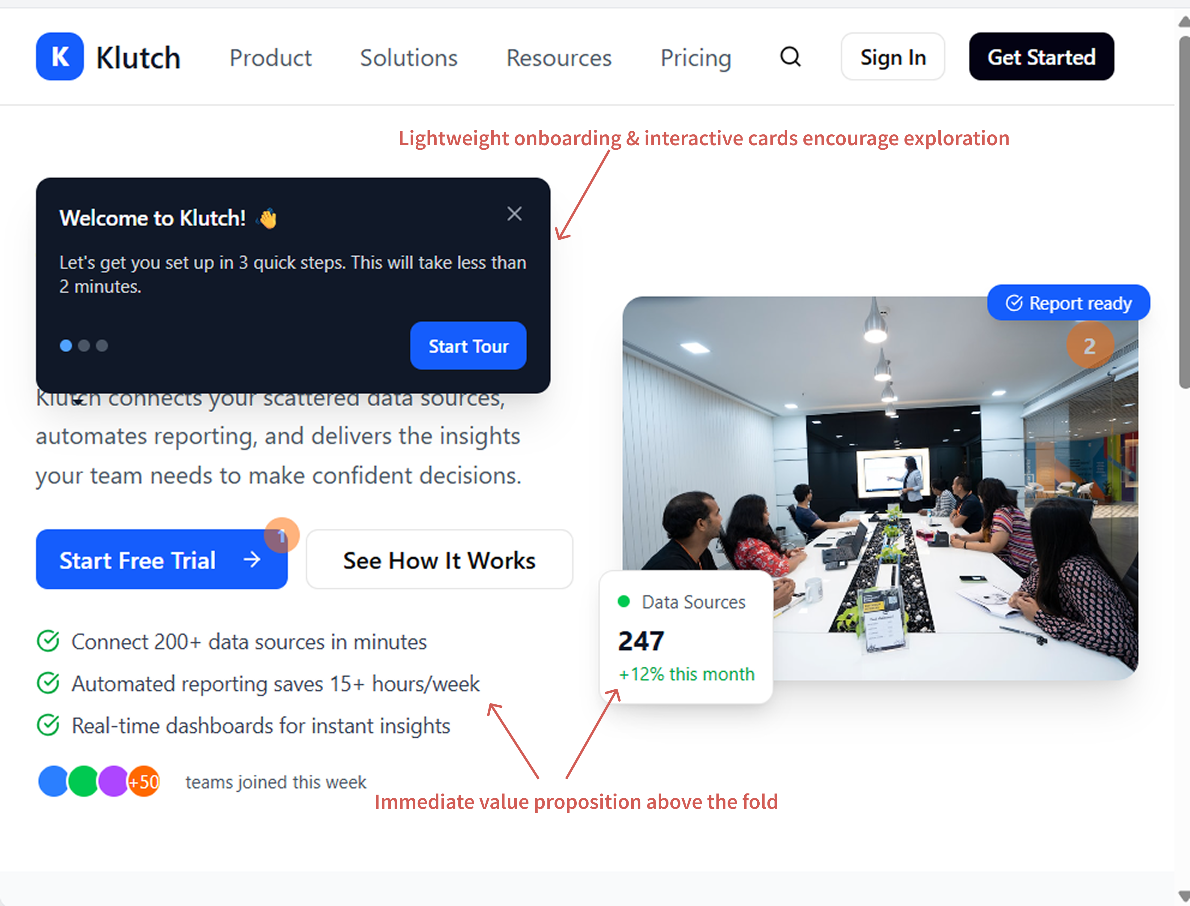
Hotjar heatmaps showed ~67% of new visitors bounced from the homepage without scrolling past the hero section. The value proposition was buried below the fold. Returning users clicked deeper, but first-time visitors left before understanding what the platform did.
Solution
- Refactored hero section: moved headline + core value prop + primary CTA above the fold
- Introduced lightweight onboarding tour (optional, non-intrusive) to orient users in first 5–10 seconds
- A/B tested messaging: "Kubernetes Operations Simplified" vs. "Reduce Cloud Downtime" — tested which resonated with target audience
- Added secondary CTAs (Demo, Docs, GitHub) for different user intents
Impact
Above-fold value prop + lightweight onboarding reduced bounce rate from 67% to 52% within 2 weeks. Scroll depth increased 40%. Users who engaged with the onboarding tour showed 3x higher signup intent.
- Mobile Users Active But Confused
Challenge
Mobile analytics revealed a puzzle: mobile users performed 17.5 actions on average vs. 8.3 on desktop, but mobile sessions were 226 seconds vs. desktop's 911 seconds. High intent, low dwell time. Heatmaps showed rapid scrolling and dead-end pages. Users were hunting for CTAs and getting lost in dense content.
Solution
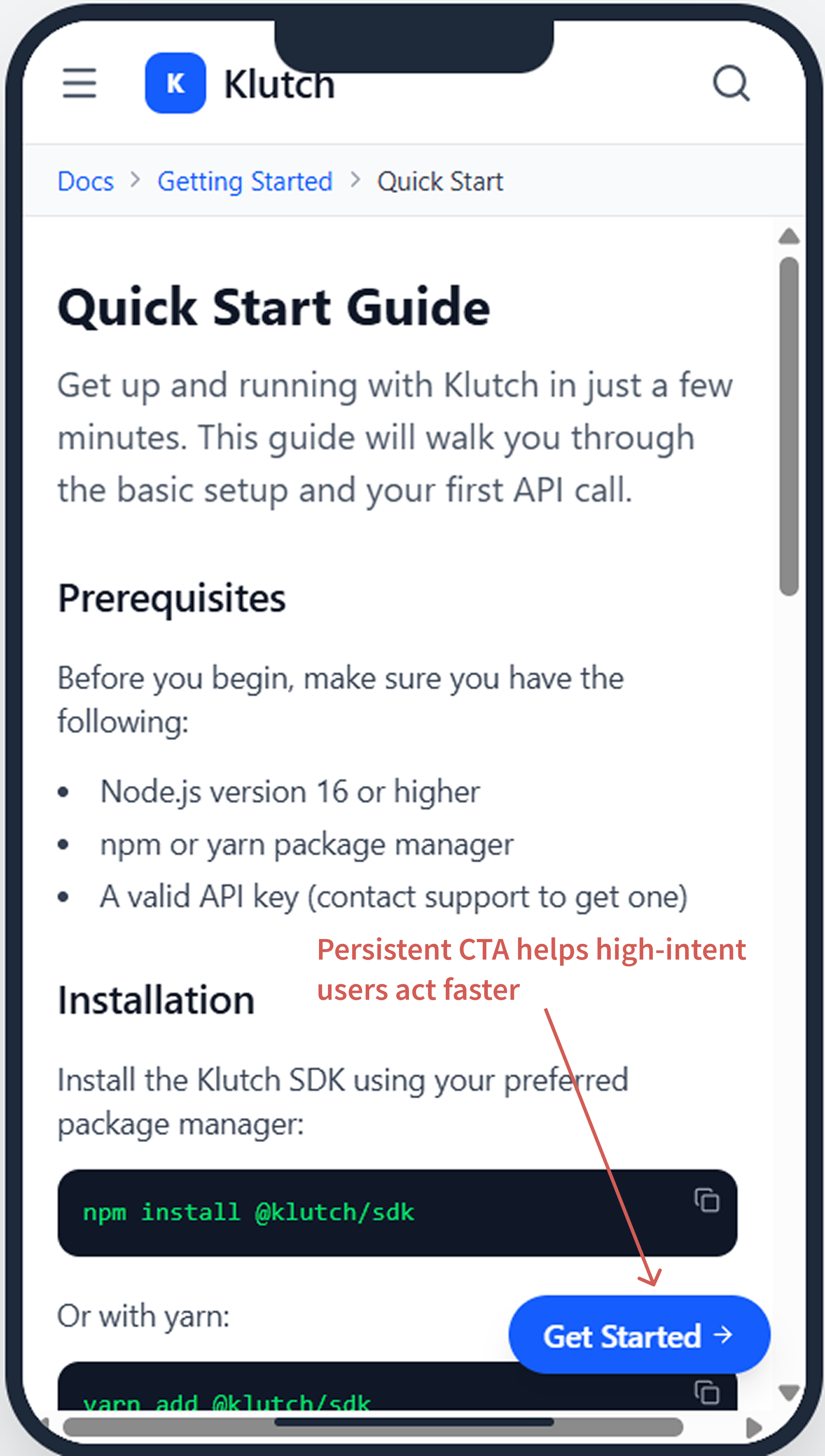
- Introduced sticky mobile footer CTA ("Get Started" button stays visible while scrolling) to capture high-intent visitors without hunting
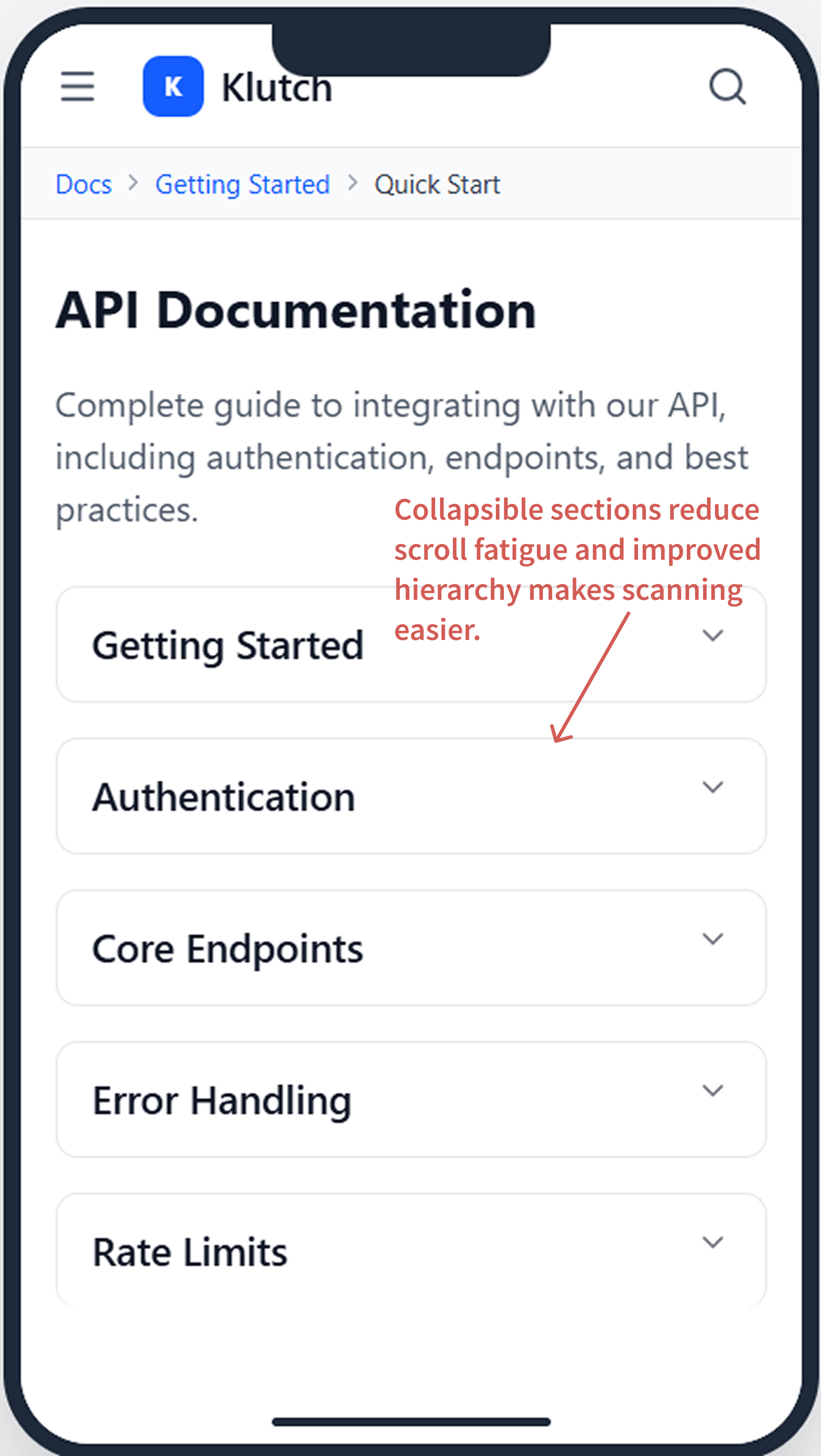
- Refactored long content pages with accordion/expandable sections — users could scan quickly and tap for details
- Reduced form friction: multi-step signup → single-page form with inline validation
- Added breadcrumb navigation on mobile to reduce "lost" moments
Impact
Sticky CTA improved mobile signup clicks by 31%. Accordion patterns reduced page abandonment by 18%. Mobile conversion rate increased from 1.8% to 2.9%.
- Documentation Dead End
Challenge
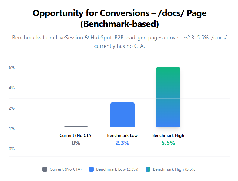
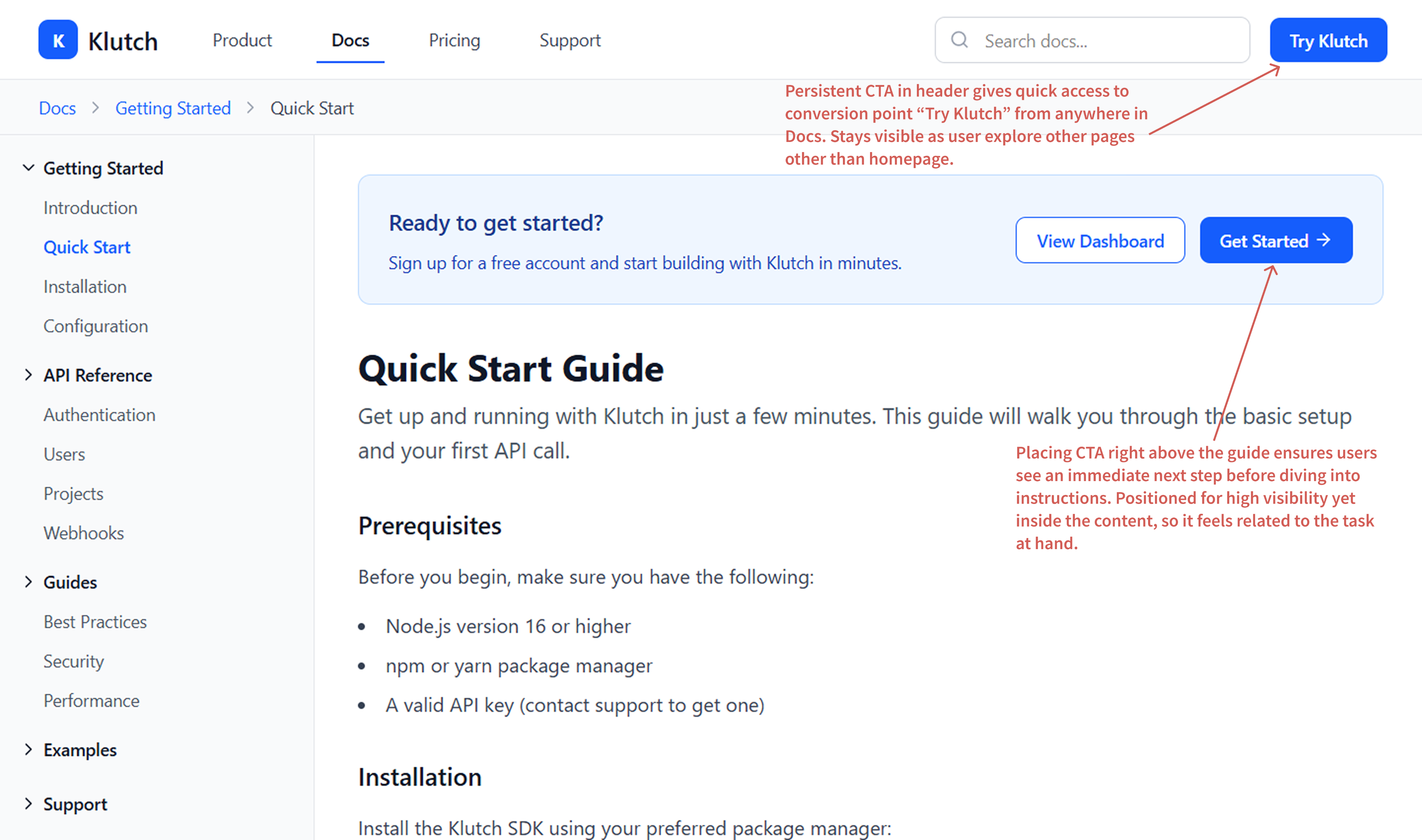
The /docs/ page received high mid-funnel traffic (returning evaluators, serious buyers), but showed 192 exits vs. only 89 entries. Most visitors arrived mid-journey and left without guidance. No next-step CTA meant users finished reading and bounced, leaving conversion opportunity on the table.
Solution
- Added contextual "Next Steps" CTA at end of each doc page (e.g., "Ready to deploy?" → "Get Started", "Want to see it in action?" → "Request Demo")
- Implemented "Related Docs" navigation to keep users engaged and reduce bounces
- Added breadcrumb trail so users always knew where they were and how to navigate back
- A/B tested CTA copy (3 variations) to find the highest-converting message for mid-funnel evaluators
Impact
Contextual CTAs converted 8.2% of doc-page visitors to signup (up from 2.1%). Exit rate dropped from 192 to 128. Docs became a lead-gen channel, not a dead end.